
David Ricci’s Edge of Chaos
Studio Visit with a Berkshire Photographer
By: Charles Giuliano - Feb 14, 2018

For the past year the Berkshire based photographer, David Ricci, has been working on a large format, expensive and ambitious book. It has a working title of Edge of Chaos and surveys four decades of his oeuvre.
Early on he toured widely to sell his work. As it evolved and became more complex he shifted focus to being represented by mainstream galleries. Ricci had a solo show at the Berkshire Museum as well as one at the Art Complex in Duxbury. He has been included in group shows at the DeCordova Museum of Art, twice, as well as the Danforth Museum and other venues.
From the beginning the focus has been on color. For subject matter he has looked at nature but with an evolving specificity.
An autodidact, Ricci has a background in science and technology. Over time a confluence emerged between theory and how to select images that apply to intellectual and aesthetic groupings and paradigms.
Conveying the chronology of the oeuvre and periods the book is organized into chapters- Elements, Emergence, Fission, Fusion, Strings and Waves.
On a snowy day I drove to Lee to visit the artist and view the work. There were stacks of matted prints on several tables as well as the kitchen counter. The studio visit evoked an insightful dialogue about scientific theory, art history, color photography, technical elements, and aesthetic development.
That overview, entailing surveying decades of work, allowed for an understanding of decisions involved in selecting images and organizing chapters.
Exquisite books of color photography are complex to design, and expensive to publish. Color separations for each plate add up to thousands of dollars. The major publishing houses produce books focused on established photographers and subject matter with popular appeal.
There are boutique publishers who take on projects such as that initiated by Ricci. He has been approaching these resources.
In recent years there has been a development of cost-effective, self publishing. Using a technical process similar to a desktop printer allows for creating and purchasing individual books on demand. The quality is remarkable and does not entail the front loaded investment of offset printing an edition of books.
We examined a Blurb proof of the book. Many photographers use this process to self-publish books. At photography conferences Ricci has met and networked with individuals who take this approach. We discussed the plus and minus aspects of what that entails.
What follows is an edited transcript of an in depth encounter with the photographer and work in progress.
Charles Giuliano What is the intent of the book?
David Ricci. That's something I've struggled with. It needed to be more than a monograph.
Before I became a photographer my background was in engineering and science. Over the years I was interested in complexity theory and chaos theory. When I read about it my book was going in that direction in terms of composition. As I was approaching subject matter my compositions were becoming ever more complex.
I’m interested in complexity theory. That's how I've structured it.
People who have seen it say that perhaps I am trying to do too much. There are multiple themes and lots of different subject matter.
The way I've organized the book is essentially chronological.
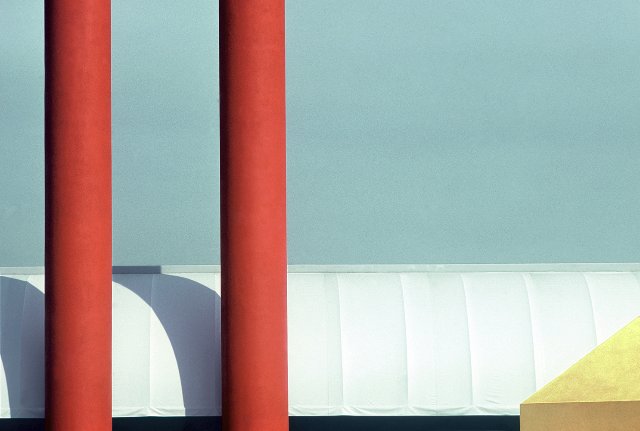
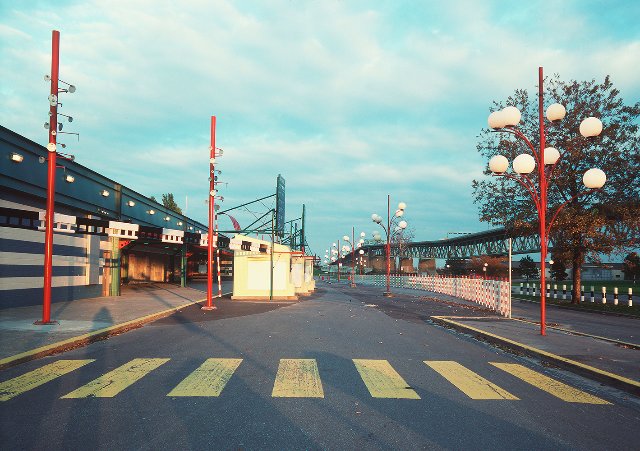
The first section of the book is Elements. That's my work from the 1970s and 1980s. The images are minimalist with architectural subjects. They are geometric and influenced by Mondrian.
The second chapter of the book is Emergence. The compositions start off fairly simple and become more complex. That was a ten year project and currently it's the largest section of the book. I developed an approach of increasing complexity.
The next four sections make use of that. They are Fission, Fusion, Strings and Waves. Again, there are connections to physics.
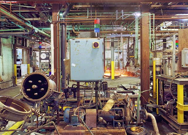
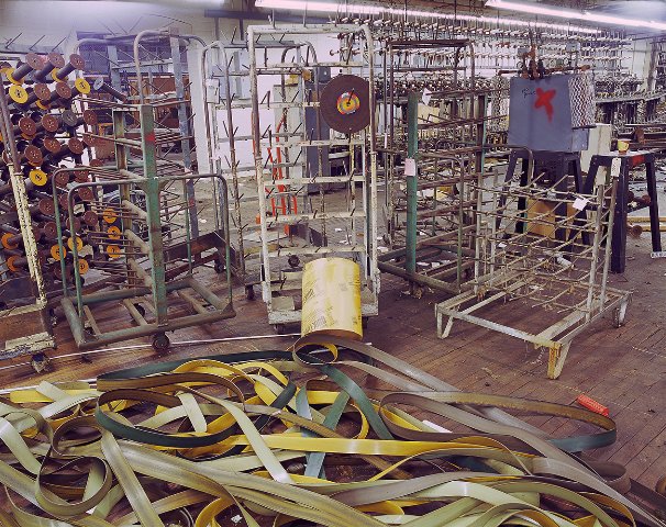
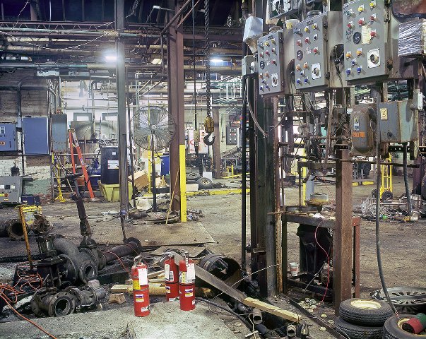
The subject matter for Fission includes demolition sites, factories being closed down, and disaster sites. Things are coming apart.
Fusion is about scrap metal heaps and recycling centers where things are coming together.
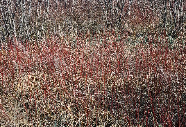
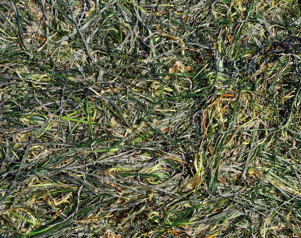
The subject matter of Strings entails thickets and brush.
With Waves I struggled with the title. It's about fishing boats and piers. It's not as literal as the other titles.
CG With a background in physics and science it appears as though you had a theory and then photographed to demonstrate or prove those ideas as occurring in nature and the environment.
DR I didn't do it that way. It's just the way things evolved. Now I am making those parallels.
CG When you are out with a camera what do you look for?
DR Primarily it’s about the visual structure of the photographs. When I started I was a nature photographer like everyone else in the world. Eliot Porter, a nature photographer, was one of my heroes. I studied Ansel Adams and all of the greats from that era.
I started off shooting black and white for about three and a half weeks. I realized that this is not my thing. Even when somebody asked me to shoot something in black and white I sent them to somebody else. I don't see the world that way. I see things in color which is a whole different way of looking at things than abstracting in values. Color has always been a very important part of what I do.
CG Now, with digital photography, color is not a daunting issue. When you were working back in the day it was. Could you discuss the challenges?
DR When I was working on the Elements series I was shooting Kodachrome and sometimes Ektachrome and making Cibachrome prints. I was making up to 20 x 24" prints. There were only a handful of us in the country making Cibachrome prints in that size at the time. You printed in rotating drums where you had to maintain the temperature within a half a degree. Eventually, I turned to a lab in Connecticut and things got a little better for me. You're right, it was problematic.
CG How long did it take to make a print?
DR To get it right could take a good portion of a day. The chemicals were highly toxic and after awhile I stopped making Cibachrome prints. I liked the look of them but they were metallic with high contrast. Some people didn't like them and preferred the Type C prints which were more relaxed and laid back. For what I was doing Cibachrome was an appropriate material to use.
CG No doubt your technical and scientific background was an asset in the work.
DR I'm self taught and what that means is that I made every possible mistake that a human being can make in the darkroom. I learned by trial and error.
CG What did the switch to digital camera and Photoshop mean to you?
DR I was a late adapter to Photoshop. That was about eight or ten years ago. I got my first digital camera about four years ago. The first work was all shot in 35 MM and then I switched to Medium Format. In the late 1980s I was shooting with a Pentax 6x7. That was my go to camera for the next two decades then I bought a 4x5 view camera to shoot nature. I went back to the Pentax before I got a Nikon digital camera.
CG Do you make digital prints?
DR Yes, I can print 17x22." I don't like inkjet prints. I prefer lightjet prints. When I do large prints I use Duggal labs in New York. It's very expensive. Sometimes I sell large photographs but I have a day job and don't have to depend on this to make a living. It's a passion which I have been doing for forty years. There are years when I've turned a profit.
There were years when it was all I did. I traveled around to art fairs back when I was doing architectural images. I traveled to Florida and the Midwest. I got tired of traveling all around the country and as my work evolved, and I thought got better, my audience shrank. People who buy from those shows are looking for decorative works to hang on the wall and match the couch. Early on I had work like that but as it got more esoteric the audience diminished. My emphasis shifted to galleries and museums.
CG Did you have success with that?
DR I've done a number of solo and group exhibitions. I had a solo at the Berkshire Museum and at The Art Complex Museum in Duxbury. Regarding group shows I exhibited twice at the DeCordova Museum and also at the Danforth Museum.
CG When did you show at the Berkshire Museum?
DR In 1984 curated by Marion Grant.
CG Do you have work in the collection?
DR No. They never purchased a piece. I should get back to them but now is not a good time.
I am self taught and my work is as much influenced by 20th century painting and sculpture as it is by photography. I found over the years that the work itself led me. It wasn't like I set out with a particular project. I know a lot of photographers work that way but I don't.
At first I was just photographing nature. I was on Cape Cod when I stumbled onto shooting architecture.
Let's look at the work. I haven't had a studio visit in some time.
(Spread out on tables and the kitchen counter were piles of prints. They were organized by chronology and subject matter. We also moved to other rooms where large format prints are hung. Viewing individual works created the ensuing dialogue.)
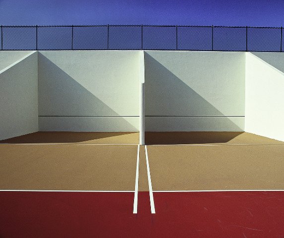
That's an image of handball courts. It was the most popular image from that era (1980s) when I was doing street fairs.
These are all Cibachromes which I printed myself. At the time they were the most durable prints. They're not even on paper. They're on plastic.
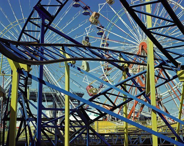
This piece was a transition into the next series Emergence which was about amusement parks. There's a ton of these pieces. Some are matted and some are loose. Instead of going up close and framing something two dimensional I started opening up the space. There was a more navigable space. This is when I bought a medium format camera.
I was working along the East Coast going to amusement parks. So I’ve got the whole geometric thing but now it is more spatial with more motifs. I was looking for shapes, colors and forms that repeat themselves. That came from studying painters. This piece is called "Here Comes the Sun." A lot of them were still very formalist.
Shooting the amusement parks there were two things going on. There was a formalist thing and some of them also had a narrative element. This is “Wonderland” my most popular piece of all time. It is in the collection of the LA County Museum of Art and the Winnipeg Museum. (It's an image of a moire overlay of carousels, 1993, from Ocean City, New Jersey.) I print this in various editions including a 60x72" edition of three. I print it 48x 60" but it holds up real well at 60x72." Again, it was shot on medium format film.
CG Have you archived all that film?
DR Do you mean have I digitized it? No, I have all the film. It's all in binders.
CG Under climate controlled conditions?
DR It's in my living room. I've scanned to digital only images that I plan to print. I know that photographers talk about converting their entire archive. But I just don't see the point. I have thousands and thousands of images. It takes time and money to do that. (Referring to stacks of prints.) The ones that I have converted, like all these, have been converted because I've made prints of them.
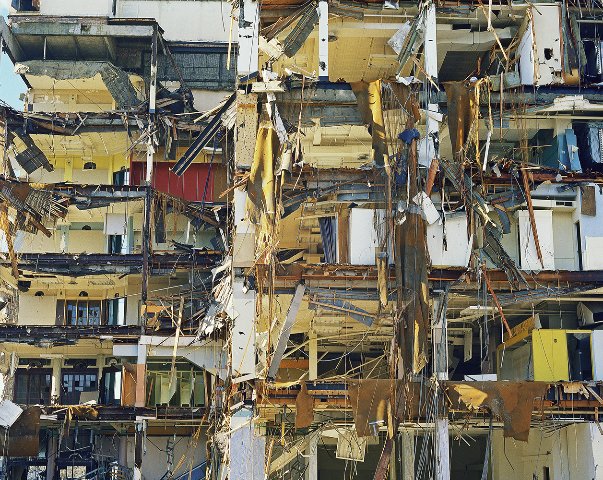
The next section is Fission.
This is the cover image. ("Departure" Pittsfield, Massachusetts, 1998) Most people love the image. Some people comment that they find it too busy. It’s cropped and the title is laid down over it.
This is the demolition of England's Department Store in downtown Pittsfield. It was the main retail outlet in Pittsfield when I grew up here. Now Berkshire Bank is on that site. I was born and raised in Pittsfield and went to Pittsfield High with our artist friend Bob Morgan. At the time I wasn't taking photographs and I don't know if he was painting.
Here is an image of another building being demolished. Fission, by definition, means dividing or things coming apart. This is the A. H. Rice Silk Mill in Pittsfield. A friend called me and said they arc letting people in to take photographs. So there were a number of photographers who went in when the building was being dismantled. If you look back from the earlier work to this series I was still looking at shape, color and form but there is a lot more going on.
In the 1980s I went to MoMA when I was teaching myself about art, photography and art history. I read magazines like Art in America and went to museums. I went to the Modern to see a photography show and went through the galleries of 20th century painting. I found myself looking at a painting by Jackson Pollock.
CG Did Pollock make sense to you?
DR Absolutely. I could go up very close to the painting to look at a small section. I found that there were things that were fascinating and interesting in terms of design, shape, color and pattern. As I moved further back there was a different feel to it. When I got further back, it was in a big room, it took on a different dimension.
After Pollock, when I went to the photography galleries and looked at Edward Weston's "Pepper," I got the whole thing in like 2.4 seconds. That doesn't make it better or worse. I didn't want to make photographs that looked like paintings. I wanted to make photographs that would engage the viewer over an extended period of time and reward the viewer on repeated viewings. That was key to me then and still is.
I understand that there are things that you want to get right away but I believe in sustaining power.
There was a tornado that came through the Berkshires in 1995. This is an image "Resurgence” that documents the impact on the fairgrounds in Great Barrington.
This is a lightjet print. Before the digital world all prints were lightjet prints. By that I man that light was projected onto a sheet of photosensitive paper. Then it went through a chemical process and the black and white or colors would come out. In the digital world there are a couple of options. Instead of projecting the negative or transparency onto a sheet of paper you could turn that into a digital file. Then a laser can project light onto photosensitive paper. What this entails is a laser going back and forth exposing the image. It’s a different technology than inkjet prints (giclee) which is a process of shooting out droplets of ink.
(Moving to a new body of work.) This is a Type C print but exposed by a laser from a digital file. It's the same kind of paper and chemical process. I send a digital file to the lab and they make the print. Inkjets are OK but there's something about them that's a little flat. In my view they are not quite as dynamic.
I went to a talk by Gregory Crewdson and somebody asked how he makes very large images. He prints them using laserjet. (Crewdson is a renowned photographer who lives and works in the Berkshires.)
These are all inkjet prints from the Wave portfolio.
CG They look fine to me. This was the process that Graham Nash started some years ago. (Nash was a member of the rock group Cosby, Stills and Nash.)
DR I met him back then. They were called Iris Prints. He started one of the first companies that did large inkjet prints. He had a massive photo collection. I went to one of his workshops.
Let's go back to the chronology. After the Fission series came Fusion. It was about things coming together. It was a way of organizing the work into categories.
CG How did you get the files for the book?
DR They were all scanned and turned into digital files. So a good portion has been converted but not all of it.
CG How do you feel about the reproduction (one of a kind Blurb books)?
DR This is great. (Examining a Blurb proof of the book.) You have to remember that this is a one off. This was done for what we are doing now. I can show it to you and get a sense of what it is all about. Will it look like this when it's printed? Maybe, or maybe not. It's a proof. To do an edition of a book this is not the way to go as these are not offset prints. These are printed just like with my own inkjet printer. You can't do a one time offset. To print an offset book costs $10,000 to set up compared to a single Blurb book that costs me a hundred bucks. For offset you have to make separations for every image. There are four plates for each one. To make it cost effective you have to publish hundreds if not thousands of books.
CG Who will publish this?
DR I'm waiting to hear from a publisher in Atlanta who has shown the most interest. If I find a publisher there will be an edition in the range of a thousand. If not I will self publish a smaller edition. To self publish I might go through Blurb or Create Space and be done with it.
(Those companies publish books on demand and are available through Amazon. Individual books are more expensive than if printed through offset in large editions.)
I would rather not self publish because the primary disadvantage is distribution. There are a number of photo events which I have attended where I have met potential book publishers. I also met photographers who had books published including publishing their own books so that gave me a lot of leads. So I've gotten a good feel for the photo book world. It's changed a lot.
You can self publish but have to be smart about how many books you can sell. There are so many photo books out there now and some people are doing hand crafted ones. To have a book published by a major publisher, like Rizzoli, you have to be famous or have a subject with very broad appeal. There are a lot of small boutique publishers which is what I'm focusing on. If that happens I will publish 700 to 1200 books. We would work together but they would take care of the printing and binding. I don't know how to do all that. I've met people who can guide me but I would rather have someone who knows what they are doing.
I'm also considering a version of this book with a tighter edit and smaller design. This project has been going on for a year but it's still evolving. I've loved doing it. After all these years of making photographs, now becoming a book, it's a different medium.
In this group, Fusion, things coming together, generally I have printed larger.
CG How are they different from Fission. To me they look similar.
DR They are which is why they are in the same book. These are objects coming together.
CG What are looking at?
DR It's called "Lawnmower." This is a scrap metal yard near Saugerties, New York. In the book there are titles, locations and years for every image. Some of these I have printed 48 x 60." In an exhibition there is a different feel to it. I don't like printing large just for the sake of printing large. Because there is so much going on they lend to being printed large.
That's something I struggle with in the book. Does the image still come off reduced to 11 x 14?"
CG That's very dense. What are we looking at?
DR It's crushed metal. Things have gone through a compressor. It's not included in the book. I've never exhibited it. You never know what will appeal to people.
CG With this work it is all on one plane. It strikes me as a surface. There are objects within it but it appears flat like a painting. The other works are more like images of sculpture. This feels more comfortable to view and relate to. It conforms more to the context of evaluating paintings which I am well versed in. With the relief images I am less sure of what I am looking at. The space and dimensions are more complex and chaotic.
DR Let me show you a 40 x 60" image from this series. (Moving to the living room.)
CG The scale does make a difference.
DR In this series there are a half dozen of them printed in large format. Here I am shooting rebar. That got me back into shooting nature. This was influenced by Eliot Porter (1901-1990).
CG He was one of the first to use color. What was the medium?
DR Dye transfer. I have a friend from Shelburne Falls who took a workshop with him. As I recall it's like doing offset printing with pieces of Mylar.
(The dyes used in the process are spectrally pure compared to normal coupler-induced photographic dyes, with the exception of the Kodak cyan. The dyes have excellent light and dark fastness. The dye transfer process possesses a larger color gamut and tonal scale than any other process, including inkjet. Another important characteristic of dye transfer is that it allows the practitioner the highest degree of photographic control compared to any other photochemical color print process.)
CG Paul Outerbridge was another pioneer of fine art color photography.
DR He was. A while back I put together a slide lecture on the history of color photography. The last time I presented it was at the Fleming Museum at the University of Vermont.
Being in the Berkshires I spent a lot of time on hiking trails. Several years ago I had photographed traditional nature. I wanted to go back and try something different. It's not easy to do something different with nature.
CG (Looking at a tangle of vines from Strings.) I have a friend (Rick Harlow) who is painting that exact image. If he saw that print he would see how it relates to his work.
(I did indeed show the book and Strings to Harlow. The painter stated that he photographed similar thickets which are a part of the genesis of his abstractions. Overtly, they resemble the drips of Jackson Pollock. The process of Harlow, however, is more methodical including layering and building up patterns and lines. The commonality of source material for a Berkshire based photographer and artist is intriguing.)
DR As I mentioned before, 20th century artists are an influence in my work. But I am not trying to make images that look like paintings. I am trying to do my own thing which engages the viewer.
When I first showed these I called them Thickets. In the book I'm calling them Strings.
CG Explain String Theory to me.
DR I don't know if I can. I don't know how much to get into that in the book. In general the book needs more text.
What I have in the book is "String Theory suggests that elementary particles in the universe (quarks and such) are simple different manifestations of an even more rudimentary entity-strings, and their vibrations. The oscillations of unlimited elementary string loops harmonize, like an orchestra of countless violins, to create the transcendent music of the spheres."
You have atoms and more fundamental to atoms are particles. The parts of an atom are electron, proton and neutron. More fundamental to that are quarks and some people think that even more fundamental to that are strings. It is an ethereal, spiritual thing that the entire universe comes from. Beyond that I can't say. I'm not a physicist and I am not trying to make this into a physics book.
CG Everyone talks about it but nobody can explain it.
DR I have friends who can.
CG We're looking at the tangle of brambles in one of the Strings images. Talk to me about the quality of light and amber tones. It has a unique specificity.
DR It was taken in the fall along the Ashuwillticook Trail in Lanesborough. "Color Field" (2009) is another print I have done in 48x60." It is something we see every day hiking, biking or passing by. It's not a dramatic landscape but we move in and observe subtleties. It's not a sunset or enticing view of an iceberg but to shoot it at a certain time and light and state of vegetation reveals something that is interesting. It has a number of visual correlations going on.
CG It relates to the sublime randomness of nature. There is no human intervention, as in the cultivated garden, when encountering what to most is simply a thicket. It is the artist's eye that freezes the decisive moment and invites us to find the patterns and abstractions that are embedded in the apparent chaos. Inspired by nature Pollock was capable of evoking the sublime. As he famously stated "I am nature." This is an example of how absorbing abstract art leads us back to a deeper observation and understanding of the natural world. The dynamic of that synergy invests your work and supercharges its visual impact. It evokes a moment of wonder when we don't quite know what we are looking at.
Looking at the Strings photographs, and referencing Pollock's drip paintings, explores the razor edge between artist and shaman. We are drawn in by an unknowable spirituality like Theseus in the Labyrinth. The Minotaur that the creator faces is self.
DR There is always a transitional image that leads to something else. While there is a similar approach to photographing brush and thickets in this case the subject was fish netting.
(Examples in the book are "First Encounter" Eastham, Massachusetts, 2002 and "Nets" Newport Rhode Island, 2010.)
Despite the randomness there are discernable patterns running through the photographs.
We now come to my most recent body of work from the Waves series.
CG We are looking at lobster traps.
DR Yes. This is called "Recto Verso" the front and back side of a stack of fifteen traps. From the all over thing I'm going back into junk and objects. Most of these were shot along the harbor of New Bedford, Massachusetts.
CG What do you mean by Waves?
DR That they were shot at commercial fishing piers. These are boats that go out on the water and onto the waves. So the title is more of a stretch than the others in the book. They don't have to correlate in the exact same fashion.
So that gives you an idea of what's in the book. I am now working on a new series that has nothing to do with this. Let's talk about that another time.