In the Studio with Rick Harlow
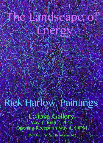
Eclipse Mill Gallery Exhibition Opens May 1
By: Charles Giuliano - Mar 29, 2018
With the Boston painters, Roger Kizik and John McNamara, in the 1980s Rick Harlow emerged as an Epic Abstractionist. That was not long after completing a BFA from Massachusetts College of Art in 1975 and MFA from University of Cincinnati in 1979.
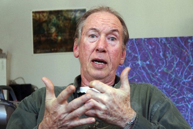
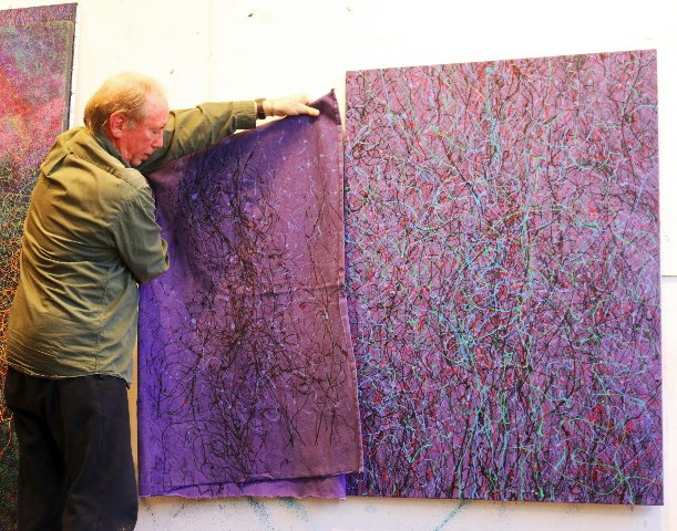
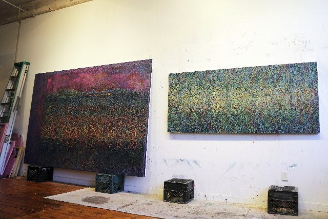
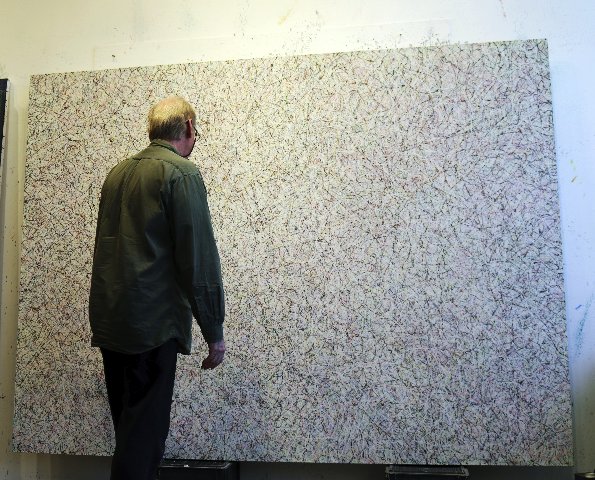
For the past dozen years we have been neighbors in the Eclipse Mill in North Adams, Massachusetts. Recently, we met in his studio to view and discuss a dozen or so mostly large scale, dripped and splattered, abstract paintings.
They will be included in his first ever solo show in the Berkshires “Landscape of Energy” opening on May 1 at the Eclipse Mill Gallery. He has shown regularly at Clark Gallery in Lincoln, Mass. In 2006, I curated his solo exhibition for the New England School of Art & Design/ Suffolk University.
With a bit of banter, when clearing out some files, he passed along a review I had done back in the day. It seemed to hold up well though he jabbed that I had incorrectly surmised that he had used airbrush in the large abstract paintings.
Hopefully, I will get it right this time.
A couple of years ago Astrid and I commissioned a small painting for our collection. At the time, I insisted that it be in his Amazon inspired mode and not one of his “Jackson Pollock” paintings. While taking offense he complied. After the studio visit, however, I may have made the wrong decision as the new work is indeed complex, multi-valent, challenging and exquisite.
We were both in transition as is so often the case. I had just returned from a week at a theatre conference in Milwaukee and he was about to depart for Colombia. He will be back in back in time to install the exhibition.
Ongoing work with indigenous people is an important part of his persona and aesthetic focus.
“For the past 31 years I have been traveling to Colombia” he said. “Much of this time I spent along the rivers Apaporis and Mitití Paraná, living with Macuna, Yucuna, and Tanimuca peoples. They taught me to feel at home and at ease in the forest, how to walk without falling down, how to hunt, fish and gather food. They taught me about the different plants, insects and animals. They showed me which ones are useful, which are dangerous and which are sacred. They told me their stories of how their world was created, stories of how they came to live there, stories that explain their relationship to all living things and their place and purpose in the web of life. Stories that contain great lessons on how to live correctly, stories of the spirits that live in the rivers, in the forest, in the underworld and in the Milky Way. They invited me to participate in their rituals, dances and sacred ceremonies. They initiated me into the tribe and gave me a new name. They introduced me to the visionary teacher plant Yajé (Banisteriopsis caapi) or Ayahuasca as it is more commonly known. I was taught that this sacred plant is the umbilical cord that connects us to the cosmos.”
“These experiences have served as the main inspiration for my paintings. In creating these works, I do my best to paint not only what I have seen, but also what I have felt or sensed. Sometimes I combine landscape with visions I have had during the rituals.
“In 2008, I visited the Sierra Nevada de Santa Marta on the Northeast Coast of Colombia, known as ‘The Heart of the World’. This coastal mountain range is home to the Kogui, Arhuaco, Wiwa and Kankuamo pueblos. In 2009 I entered into an agreement with the Traditional Elders of these pueblos to support their efforts for the preservation and continuance of their spiritual practices as guardians of the Heart of the World. My duties involve recording and documenting the spiritual work with photography and video, fundraising for the annual Black Line Journeys, providing support for the education of a new generation of mamos and publishing the recorded wisdom of deceased Elders for their historical archives.”
One of the great pleasures of a career as an arts critic is the span of decades viewing and commenting on the ever evolving work of artists.
As we enter the legacy phase of our careers there is a concern for the work and how it will be preserved and appreciated. Looking around the studio he made the revealing statement that most of what he has made has been sold. Other than new work there is not a lot of inventory.
Recently, a very large painting came back from the DeCordova Museum. It is a stunning work now installed on the ground floor near the mailboxes. The hanging is temporary as the collector is in a stage of renovating before it will be returned. There are also examples of evocative Amazon based landscapes hanging outside his second floor loft studio.
Phasing from emerging to mid career most artists find and fixate on a style and technique. Tracking through their exhibitions entails variations on a theme. It is relatively rare for artists to take on an abrupt and dramatic new direction.
In this case, the work shifted through a combination of serendipity and then later calculation, mandate and strategy.
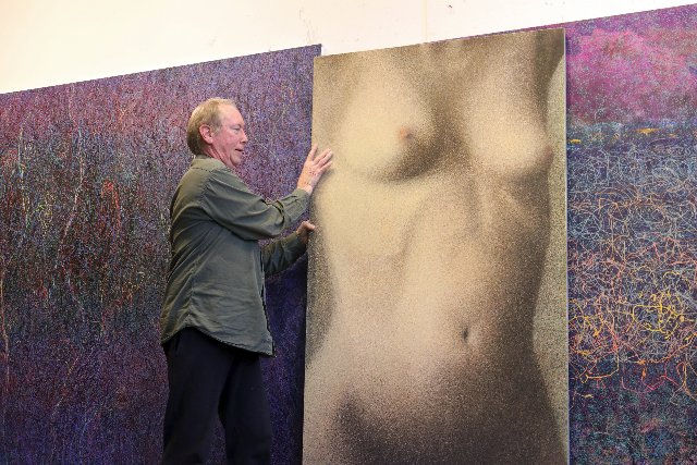
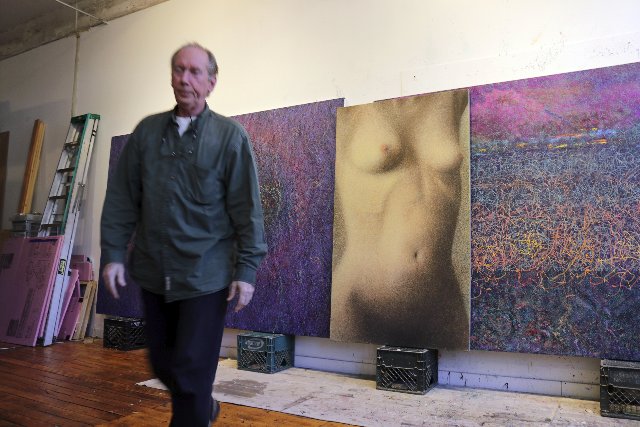
Having viewed and discussed several works from the past couple of years he brought out a large, female, nude torso. Using a careful spatter technique, in 2002, he created what he regarded as an anomaly. For the exhibition, as a marker, he is borrowing the painting from its owner, an Eclipse neighbor, bookseller Grover Askins.
Looking at the large painting evoked a post modern take on Pointillism and works by Seurat.
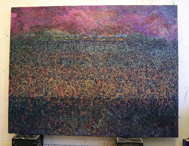
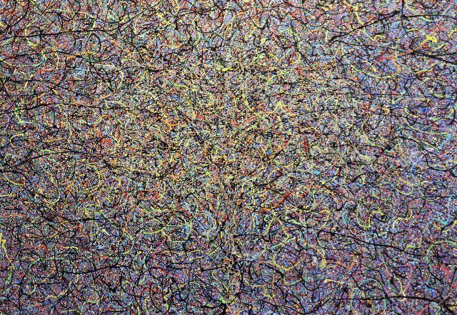
The spatter/ drip technique was a theme he returned to in the Spring of 2016. He readily admits the inspiration of Pollock but prevailed that, as a point of departure, there was unlimited potential to explore and expand upon.
There have been generations of artists inspired by and evolving from de Kooning. But few, if any, derived from Pollock whose signature attack and technique evoke immediate comparisons. As Rick explained, there is a distinctly graphic quality to Pollock’s approach as an extension of full bodied, gestural, drawing in space. Mostly that entailed painting from above and around onto canvas spread out on the studio floor.
By contrast, Harlow works on stretched canvases also placed onto the floor. Compared to Pollock’s ubiquitous white ground, the surfaces are built up carefully. There is a field of color over which the spatters and drips are layered. He discussed squeezing out pigment which is then manipulated, spread and scumbled. This is intuitive and gestural as well as controlled. In contract to the quick, trance-like dance of Pollock the approach of Harlow may take months to develop and finish a painting.
While overtly they may look similar, unlike Pollock, in no respect may Harlow be described as an action painter. A discussion of his work does not fall within the domain of the dominant critics of abstract expressionism, Clement Greenberg and Harold Rosenberg. Indeed, like Harlow’s beloved Amazon, we are treading on terra incognita.
While he has clearly created a connected series of works he also sets the challenge that each painting is unique and advances a self referential dialogue. The goals and end game are entirely internal and he has little concern for how the work is critiqued.
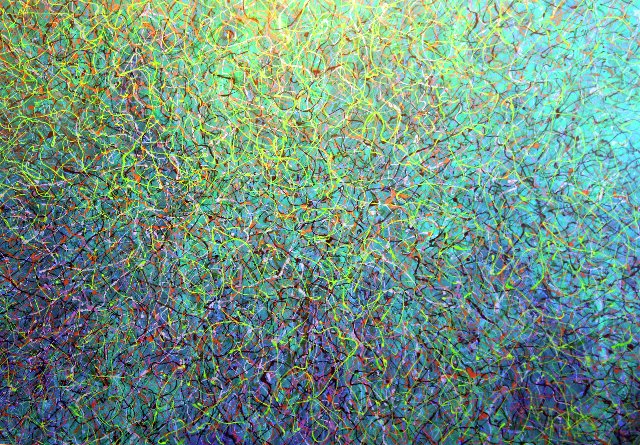
Mostly it is about color. One dominantly green abstraction with vibrant, squiggly, worms of snap, crackle and pop colors reminded me of the paintings of the Northwest Visionary artist, Mark Tobey, or aspects of the abstracted surrealism of Max Ernst.
The frenetic dance and energy of high-chroma, twisting and turning drips evoked the Uncertainty Principle of molecules appearing and disappearing in the quantum mechanics theories of Werner Heisenberg. Asked about it Rick confirmed that he had read a lot about chaos and string theories. There is a palpable connection but he deflected the notion that he was trying to map out or describe theories of science.
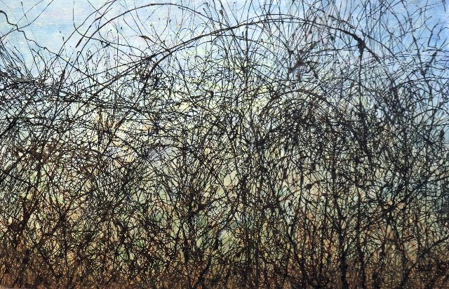
The landscape is also an important connector. He showed me a smaller work which he identified as clearly a landscape. Obviously in the Colombia based paintings, but also in work created in the Berkshires, there is a connection to nature.
This proves to be more subliminal than literal.
We looked at a large, white-on-white painting. My initial response when it was paired with a dominantly dark, or black painting was less than positive. He reminded me of making dismissive comments when they were hung side-by-side in a Gallery 51 exhibition. Looking long and hard I was willing to change my mind about the white painting but not the dark one.
For a critic there is a certain something, a ‘click,’ as Brick put it in “Cat on a Hot Tin Roof” that happens when, with some struggle, we finally connect to a specific work of art.
Delving further it was not that surprising to learn that the untitled white painting had been created during a Berkshire winter. All that snow got into the studio. Evoking blizzard conditions I dubbed it “Whiteout.” That naming gave me a template for entering and appreciating the paining.
When dealing with abstract art we often need that portal. There is a non objective painting by Kandinsky, in the Art Institute of Chicago, which has a vernacular, populist identity as “Canons.” It’s not the title the artist gave the painting but it’s what people see. It is also significant that the weapons of mass destruction were channeled on the eve of WWI.
Building on those notions of nature Harlow elaborated that a painting with an array of bright colors was inspired by brilliant fall foliage. Working with abstraction allows for those references.
In another work he discussed how a pattern of lines over a complex ground resulted in the outline of a female figure. Once you see it the notion won’t go away however tentative and ephemeral. I suggested “Spectral Presence” for that untitled work. He asked me what I meant by that.
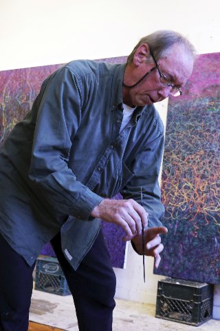
Working on the floor and even stepping on stretched canvases he pointed to foam core he uses beneath the surface. That prevents damaging a work in progress. He also described using rags to blot the paintings. I responded that de Kooning used newspaper to blot his juicy paint. That left ghosts of type if you look carefully.
One of these rags suggested an idea for a painting. He held it up next to the resultant work. That image was used as the background to create the poster and logo for the show.
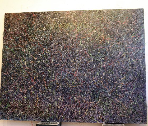
Looking at the work there was a range of responses. In a couple of instances the all over patterning was so dense and disparate that the impact was off putting. As I explained to the artist it allowed the viewer no entry and exit points. The works which, to me, were most successful allow space and breathing room to the saturated, thin, color lines that float on top of the paintings. We are invited to join them in a visual waltz.
Toward the end of the visit he pulled out a couple of works that, good grief, just didn’t work. He appeared to agree but reminded me that I had asked to see the full range of the project. When you see something that just doesn’t work, however, it clarifies the how and why of what does click. It’s rather like how an artillery officer hones in on the target.
Since a mandate of his approach is to try something different with each and every painting it is impossible to say what comes next. One may say that Harlow is just getting started with where this may go.
There is a difference between writing a preview based on a studio visit vs. a review of an exhibition. You are looking at works, one at a time propped up on milk cartons, which is different from the sequences of a well installed show. There is the difference between bits and pieces compared to a complete panorama.
So I leave you with that caveat and greatly anticipate viewing the exhibition.