Graphic Nonmagic
The Schlock of the New
By: Mark Favermann - Jun 18, 2007
Last Fall, my daughter and I went to see the Dada Exhibition at the Museum of Modern Art in New York. The exhibit was encyclopedic visually covering the various influences the movement had on European and American art of the 20th Century. The Dada movement was a protest against the barbarism of World War I, the various bourgeois interests that Dada adherents believed inspired the war, and what they believed was an oppressive intellectual rigidity in both art and society. Dada was an international movement with artists constantly moving from one place to another.
Dada stated that reason and logic had led people into the horrors of war, so the only route to salvation was to reject logic and embrace anarchy and irrationality. According to its proponents, Dada was not art — it was "anti-art," an anti-art in the sense that Dadaists protested against the contemporary academic and cultured values of art. For everything that art stood for, Dada was to represent the opposite. Where art was concerned with aesthetics, Dada ignored aesthetics. If art were to have at least an implicit or latent message, Dada was to have no meaning — interpretation of Dada is dependent entirely on the viewer. If art is to appeal to sensibilities, Dada was to offend. Through their rejection of traditional culture and aesthetics, the Dadaists hoped to destroy traditional culture and aesthetics. Ironically, the art of the Dadaists became a major 20th Century art movement influencing modern art and design.
About ten or twelve years ago, when computers were being integrated into the workplace and into the functioning of businesses, there was a marked fall-off in the quality and readability of magazines, publications, brochures and even direct mail letters. People who were only technically proficient were allowed to "design" publications and mail pieces. Graphic designers who were actually trained to do this work were often replaced or pushed aside by techno-geeks of a variety of skill levels. Traditional forms and aesthetics were destroyed. This was unlike what the Dadaists did to art, which was for a purpose, but instead this was done out of ignorance and even laziness.
What was happening in the graphic design world was the attack of the techno-clones destroying aesthetics, readability and quality. This was not done in protest by thoughtful individuals, but it was done because it was cheaper, faster and easier to do. To many people, it offended, made communication worse not better, destroyed ease of access of information and pushed people away from actually reading and thus being communicated with. By the way, graphic design's purpose is to communicate visually using text and images to present information. The profession of graphic design also embraces a range of cognitive skills, aesthetics and crafts, including typography, visual arts and page layout. However, the main purpose is to communicate information clearly!
Oddly, the ancient angst-driven, rather nihilistic and rarely aesthetically pleasing, individually rebellious vandalism called graffiti greatly influenced these techno-geeks. Messiness, inelegance and visually violating is somehow juxtaposed with slick, cool refined computer aided design. I never quite got how uglification and destruction of private and public property somehow beautifies. This graffiti aesthetic wrapped itself around graphic design. Perhaps the late great artists Keith Herring and Jean-Michel Basquiat influenced this odd bouillabaisse. But both artists had personal notions of how to express themselves that attempted to communicate their personal worldviews, not to make a general aesthetic statements. Oh, well.
The worst perpetrator of the anti-aesthetic was probably Wired magazine. It seemed to change its style and font from issue to issue. Reading it was a chore as most of the articles had a beginning, sometimes a middle, but rarely any real ending. But that is another story for another day. Those who claimed to have understood and appreciated what they read were either lying or terminally hip or both. Many consumer magazines seemed to go downhill rapidly as well at that time. Instead, these became publications of lists of products with no graphic flair or interest. Articles were often shoehorned in. Scores of magazine cover designs were graphically boring and often just offensive. However, fashion magazines seemed to hold their own during this period, but even big players like Time and Newsweek suffered or were graphically challenged.
Here was a case of the shock of the new actually being only the schlock of the new. In fact, when Charles Giuliano and I used to write for Art New England, there was a graphic designer (art director) there who was so trendy that I used to complain every month about her crazy layouts, badly placed captions on illustrations and arbitrary and often capricious trendiness. The publication bordered upon unreadable at times. She claimed that these were trends coming out on New York City and quite hip. Sometimes, the publishers did make an attempt at settling her down, but they felt that what she was doing was cutting edge and were afraid to appear old fashioned or out of touch. A few months later, the art director left for New York perhaps never to be heard from again.
Over the years, it seems that graphic designers have taken back some of their role as publication designers, however, the ubiquitousness of web design has forced a huge number of technically skilled but aesthetically retarded designers on the graphic world. Art and design schools (and you know who you are) are producing en masse "animators, " few of which will probably get work in their chosen field and have landed as sort-of half assed graphic designers. Others who may have been more traditionally
trained often feel that they have to make some sort of aesthetic or anti-aesthetic statement. This is often hard in the more or less standard publication business, but can sometimes be seen in logos and logotypes.
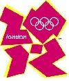
Though this "since I can do it on the computer, I will do it approach" still permeates throughout the corporate world, that does not make it right, beautiful or even provocatively interesting. Great salesmen can sell almost anything, often not very great. Several months ago, I wrote a generally complementary piece for this blog on the design of the New Institute of Contemporary Art in Boston. However, I made one rather specific criticism about the craggy logotype that was created for it by mega-design firm Wolff Olins, the high church establishment, socially/politically-connected and laughably trendy London-based design firm. I said that it was trendy, visually vibrating and not very readable. In fact, I predicted that it would be changed in a few years to something more representative and visually pleasing. Wolff Olins has struck again. Now, they have created the kissing cousin to Lisa Simpson merging with a swastika as the primary logo for the 2012 London Olympics. And, they have pissed off a lot of people.
Though It took almost a year to create and cost £400,000—that's $800,000 US, the official logo for the London Olympics was met with widespread condemnation when it was unveiled a couple of weeks ago. Within a day, dozens of amateurs came up with their versions - which many believe better capture the spirit of London and the Games. Various designs appeared on the BBC website after the corporation asked users to send in their ideas.
Olympic organizers said the powerful, modern emblem symbolizes the dynamic Olympic spirit and its inspirational ability to reach out to people all over the world. And football players always got passing grades in English classes, too. The jagged logo seems to be based upon 90's hip-hop street art, not even that of today.
And although the style and quality varies, a substantial number of these amateur designs pay homage to more familiar Olympic symbols and London landmarks. Many feel the creators of the official logo ignored such icons in an attempt to make the logo look modern - and to appeal to the Internet generation. The overwhelming interest and efforts of these novice designers will give weight to criticism that the public was not involved in the design process. Aside from its aesthetics failings, the logo has also caused offence. Supposedly, at least one Jewish person rang the BBC to complain that it was reminiscent of the swastika.
Wolff Olins, referred to in the UK as a brand consultancy firm with clients around the world was founded in 1965. Its stated mission is to assist companies to promote and rebrand themselves by coming up with original logos and designs. Among its clients are the Tate Modern, the Samaritans and the 2004 Athens Olympics, for which it created a simple blue logo. Its major success stories have been with Orange, where it created a billion-dollar brand through its advertising campaigns, and with Tesco, where it rebranded the supermarket's products. However, the firm is no stranger to controversy.
In the early 1990s, BT spent millions on Wolff Olins design of its unpopular 'piper' logo, only for other firms to claim it was similar to many other corporate emblems. It was dropped 12 years later. And when public services unions Nalgo, Nupe and Cohse amalgamated, Wolff Olins spent £65,000 ( $130,000 US) coming up with exactly the same name Unison that employees had come up with in an internal competition.
Eurotunnel spent £500,000 ($ I billion) on the company's services to come up with a name for the rail service - eventually named Le Shuttle. The London-based firm has offices in New York, Tokyo and Barcelona. It was bought by U.S. firm Omnicom in 2001, where it forms part of the Diversified Agency Services Group, which deals in marketing and communications. The Prime Minister of England-in-waiting Gordon Brown's wife Sarah worked for the Wolff Olins before she started her own PR firm. Connected? Youbetcha.
Though it was designed to unite and inspire the nation, immediately the newly unveiled logo for the 2012 London Olympics was condemned as naive and old-fashioned and a puerile mess. Even though the Games' organizing committee insisted the £400,000 invested in the logo (which comes in lurid shades of pink, blue, green and orange) and is meant to be a graffiti-style play on 2012, had been money well spent. But within hours of being revealed by Lord Coe, the chairman of the London organizing committee, it had attracted a deluge of criticism from the public and from experts in the design and advertising industries.
According to English press sources, an online petition to demand that the logo be scrapped has received over 50,000 signatures. The petition reads: We, the undersigned, call on the London Olympic committee to scrap and change the ridiculous logo unveiled for the London 2012 Olympics. One person wrote: It's atrocious - hard to read, to understand and it has no significance to London or England whatsoever. Another said: This makes us look like a bunch of stupid, untidy idiots. To add injury to insult, Epilepsy Action, a British health charity, said 10 people had complained about the logo's animation and some people had suffered seizures from watching images depicting a diver plunging into a pool. The Olympic organizing group said it has taken steps to remove the animation from the Web site and will now re-edit the film.
But Lord Coe has been adamant that it puts across the image he wanted the London Games to deliver to the world. He argued: It's not a logo - it's a brand that will take us forward for the next five years. It won't be to everybody's taste immediately, but it's a brand that we genuinely believe in." As criticism mounted, even Tony Blair, the Prime Minister, waded in to insist that the logo would inspire people to make a positive change in their life. Maybe it is time for Tony to just leave? However, a successful brand could potentially bring in over a billion dollars in revenue on product sales of everything from mugs to mascots and T-shirts.
Stephen Bayley, the founder of the Design Museum, was even more scathing: It is a puerile mess, an artistic flop and a commercial scandal. It is feeble. Claire Beale, editor of the advertising trade magazine Campaign, said it had been taking calls from horrified professionals since the logo was made public. She said: All the calls were to say how awful it is. The main concern was that, while the logo and its reference to graffiti might be fashionable now, what is it going to look like in 2012? The consensus was it will look pretty tired and old-fashioned by then. Ms Beale said agencies working for the Games' commercial partners were worried it would be difficult to incorporate the logo into their own advertising.
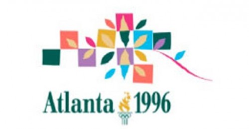
When I was working on the 1996 Atlanta Olympics design team, we were enlisted to create a visual theme to assist the rather bad logo in addressing the many needs of fulfilling the Olympic branding. Not only does an Olympic brand have to appear on the printed and now digital page, but it has to appear on the streetscape, at athletic venues, on uniforms, etc. This London 2012 mark is going to be very difficult to work with. The initial 1996 Olympic logo was also created by a mega design firm out of New York and San Francisco several years before the actual games. The problem was when you made it into patterns, it looked like hen scratches. The London 2012 one will not look much better. What to do? Atlanta had us create a thematic design as an overlay—the Quilt of Leaves. I have the original sketch in my studio. This was universally liked and was placed upon everything imaginable at events as well as on products for sale. This may be the solution to the 2012 London Logo-- a graphically stronger, more inspired overlay that diminishes the primary logo. But who knows?
Atlanta had another problem: a blue sperm-like mascot called Whazit that was universally vilified at the time of its unveiling in 1994. It was rarely used graphically and was almost invisible by the time the Olympics were held two years later. Mascots come and go, however. Logos last forever. Sam, the American Eagle was the Los Angeles 1984 Olympic mascot. When he was introduced, arguably, either the person wearing the costume was disoriented or for some other reason overcome by the Olympic moment and fell down a flight of stairs in full view. Sam was rarely seen again. Perhaps he just flew away. At the 1994 Winter Games in Lillehammer, Norway, the two small children mascots (children are apparently more important in Norway than in other countries) were drawn by a Norwegian-American illustrator from the Disney Studios. Norwegians hated the American influence. What else is new? So, the illustrations were substituted with real children, and everyone was happy. Buying into the Olympic spirit, I bought my then small daughter two character dolls at exorbitant prices. Oh, well.
Lord Coe says that the 2012 London Olympic logo will grow on us. Sun Newspaper columnist Jane Moore responded by saying that so does foot fungus.
Moral: Design is different than pure art, and therefore designers can take a lot of abuse at a price.


