Sublimating Text into Image & Image into Text
Pictorializing the Linear Barcode Symbology at Berkshire Artist Museum
By: Robert Henriquez - Jul 01, 2015
Sublimating Text into Image & Image into Text
What You Scan Is What You See … What You See Is What You Get
WYSIWYS … WYSIWYG
(Inception: 1975 — Fabrication: 2015)
The year 2015 has been a time of reflection and remembrance for me thus far, taking stock of good and bad memories. When art historian Keith Shaw, the Principal Curator of special programs for the newly formed Berkshire Artist Museum (BAM) approached me to participate in this year’s program, I accepted. The program is made of two exhibitions: “That ‘70s Show”, followed later in the season by “Then and Now”.
Once again I am asked to revisit the far past. This time, it’s not to rekindle memories but to resurrect one unfinished artistic endeavor I had put to rest, but longed to complete. I told Shaw that my involvement in the exhibitions will not be an actual artwork from the 1970s, but rather a conceptual work that I had a great deal of problems implementing forty years ago. The technology to produce this artwork with the proper precision did not exist at the time. I informed him that the work now can be fabricated. With apprehension he suggested that the a single piece will be used in both exhibitions.
Before I discuss the work, I need to touch on an anecdotal telling of the past. Back in the early '70s, I already started what was to be a long career with the CBS Television Network. At the time I had a job in technical operations, for receiving, tagging and controlling the whereabouts of very sophisticated, and excessively expensive electronic equipment.
The control was done with the use of barcode tags that I had to affix to each piece of equipment. Halfway through my two year stint in tech-ops, tagging thousands upon thousands of electronic materials, I began to see the barcode symbols in a different light.
A bizarre fascination began to surface—seeing them as visually correct images like a Bridget Riley style of abstraction. Around that time I had a brief stay in a New York City hospital to have my tonsils removed. My patient ID wristband was stamped with barcode graphs. One orderly told me that the barcodes exercise control over life and death. That was the moment when my fascination with barcodes became an obsession that lasted to this day.
To touch on this obsession, at the time, I began to formulate a concept to pictorialize this ubiquitous barcode iconography as a potential aesthetic for a different text-based art. To achieve that, I had to have total control over the iconography, and the entire process to make it so.
The barcode—also known as Universal Product Code (or UPC)—is an optical machine-readable representation of data relating to the object to which it is attached. The mapping between messages and barcodes is called a symbology. Barcode symbology systematically represented data by varying the widths and spacing of parallel lines, and may be referred to as linear. Other types of UPC mapping have also been developed and used. My interest is strictly with the linear. The idea is that the linear barcode symbology can express something abstract in a concrete form, while accurately maintaining its functionality. I didn’t want to substitute functionality for the sake of art. Keeping the connection with everyday life intact was a prime directive in the overall concept.
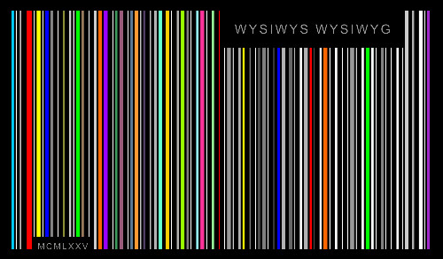
My barcodes are real and scannable. I gave them size, form and color. They are designed to look like a signature motif or trademark in a contemporary visual sense, thus taking on the same value as those barcodes affixed on everyday products. My use of a real life ‘symbology’ as an ironic expression of art is reflected in the way I present the image. As an essential and factual image, my barcode presents a field of interacting colors that provokes the eye into optical bafflement. It has a style of abstraction in which lines, forms, color and space are organized in such a way as to incite a full retinal assault.
Although the barcode image may seem to have visual primacy over the texts in the picture, it is important to note that the symbology is always generated by a text. In reality this is a binary opposition of what came first. The text generates the linear symbology, but during the scanning process the barcode symbology generates the text. In this tug of war, a ‘violent hierarchy’ ensues to set up the notion of superiority of one side over the other. It’s a situation that I hope is of interest to the viewer.
The texts displayed at top-right in the picture are two sets of acronyms: WYSIWYS and WYSIWYG. They represent two phrases—‘what you scan is what you see’ and ‘what you see is what you get’—I chose to highlight the irony in the hierarchical tug of war. The roman numerals at bottom-left represent the inception date of the concept.
The concept was to unleash a full retinal, emotional and intellectual outburst of ambiguity and meaning—a mind grenade of sorts.
The final irony: one can simply eschew the essay and have fun looking at the picture.