
Boston's New Institute of Contemporary Art
Building as Artistic Statement.
By: Mark Favermann - Dec 07, 2006
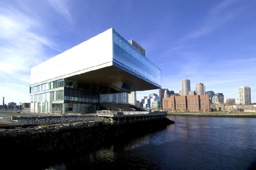


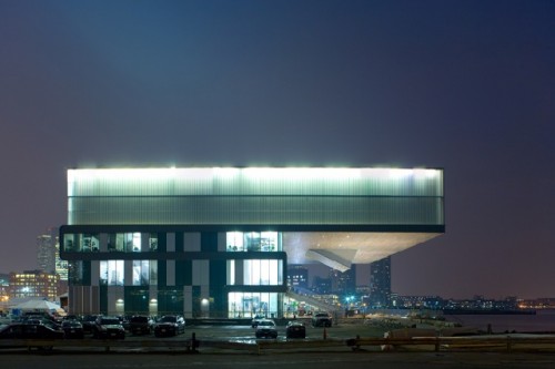

Set like an exotic jewel against the downtown skyline, the
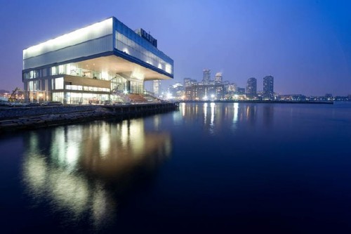
Uniquely, its geometry makes a grand visual gesture. We saw it coming for the last several years and secretly hoped for the best. Its form and promise were documented in renderings and models, and we noted its construction site schedule delays. Now finally completed, tripling its old gallery space, it is the first new museum building in Boston in 100 years. Describing it does not quite do it justice: perhaps, it is a cantilever over a boardwalk, a thrusting diving board over the sea, a flatter more rectangular box sliding over a square box, inside becoming outside and vice versa with public and private spaces morphing back and forth. Fabricated from glass and wood, metal and concrete, the structure is thoughtfully monumental, sensitively symbolic and even handsomely heroic. At night, it virtually glows. In the strongest terms, the new ICA building on Boston's waterfront is simply beautiful.
The
However, on the other side, the institutional/fundraising/museum-building side, this is not to say that there was not a major leap of faith here as well by the remarkably open and even visionary Executive Director Jill Medvedow and the ICA's board of directors. This was high culture roulette with an all or nothing stakes. Could a rather untried tandem of theoretical and often institutionally skeptical architects actually get the project done? The risk was certainly rather high. The answer is they (the architects and the institution) hit the jackpot. As conceptual artists that happen to be architects, Diller and Scofidio have created a "machine for seeing," According to Ric Scofidio, "The building is a viewing apparatus. The building looks at looking."
Glass is everywhere throughout the building. The better to see m'dear. Interestingly, glass is used rather unusually here for a museum: both clear and translucent that runs counter to the notion that a museum has to protect pieces of art from direct light. The architects solved the problem by grouping the galleries together on the fourth floor in enclosed space that though at the top of the building seem somehow strangely grounded. Galleries are highly flexible with moving walls and petitions as well as adjustable lighting. The public spaces are wonderfully light-filled on the lower levels. Therefore light below and less light above blurs boundaries, a mantra of Diller Scofidio.
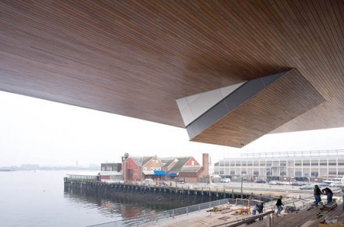
Wood is used in a startlingly appealing way on the outside of the structure and on the inside. Grey wood on the beginning of the (long talked about and finally something is done) Harborwalk is continued on the underside of the overhang. It is literally "folded" to make the grandstand and then folded again to make a platform that makes the gallery. Wood flooring and ceiling is inside the theater space. Thus, the wood boardwalk is totally reflected in the wood throughout the building. The processional staircase can be used as a public seating area or grandstand for special events, picnics, daydreaming or harbor watching. Some have already likened it to the Spanish Steps in Rome. It sits in the shadow of the 80 foot cantilevered overhang of the fourth floor gallery space. As the wood weathers outside, it will be fascinating to see if it changes much inside by everyday use.
Thoughtful details can be seen throughout the building. Metal fittings are sculptural. Railings on stairs have been designed and fitted with creative confidence. Bolts are finished metal. Each Diller Scofidio team member all helped to work out finishes and details according to partner Charles Renfro. An old architectural adage says that "God is in the Details." This may or mat not be true, but here, the details are often transcendent, even glorious. This is a very mature design project-mature in the fact that the sum is greater than its parts, but the parts are often great or near great as well.
A spectacular 325 seat theater/auditorium space is bordered on two sides by dramatically high glass walls allowing for panoramic views of the city skyline and the harbor. This is probably similar to ancient amphitheatres that were built on mountains or hillsides to allow bored or uninterested audience members to be entertained visually in another way when not focusing on the performance. The multipurpose performance space can be easily transformed into a dance venue, a theater or even a movie hall by changing the wall opacity, the lighting and the floor coverings. The backdrop can vary from the harbor background to a total blackout.
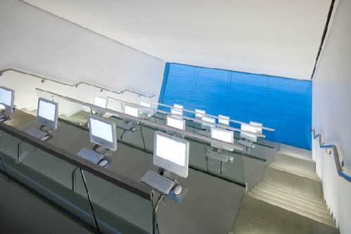
The spacious elevators are transparent allowing for a visitor to view vertically from one floor to the next. There is a windowed corridor on the top or gallery floor that virtually surrounds the visitor in the light and harbor while walking to the enclosed gallery spaces. This underscores the Diller Scofidio "blurring" of inside and outside space. This is true of the theater as well as the brilliant The Mediatheque, perhaps the most intriguing and intellectually compelling part of the ICA. The Mediatheque is a sloping room on the bottom of the cantilever that has grandstand seating with computers at each seat for interactive viewing, digital art, education and artist research. But the real genius is in the bottom of the room. Here, there is a window wall that is set just 40 feet from the surface of the water. Therefore, there is a view of the harbor framed in such a way as to allow a visual exchange with nature in a high tech setting. Thus, the architects are playing with the notion again of inside and outside as well as manmade and natural. Here art and nature work together to form an environment full of wonder and stimulation.
In a short conversation that I had with Ric Scofidio, I asked him at what point he felt that the design was resolved. His response was that Elizabeth Diller and he had created four distinct schemes. The first was a basic design. The second was a budget buster. The final design was scheme three. And the fourth adhered to the site most conventionally. Everyone preferred what became the final design. I then asked him what it felt like to finally have his first real building in the US as a completed project? He smiled and said that he was at once frightened, no terrified, exhilarated, excited, gratified and moved by the experience of the opening of the new ICA building. He paused and said that he was a little worried about some post-partum depression and smiled. Scofidio, who has been a longtime professor at Cooper Union as has Elizabeth Diller, also said that he never wanted to have to establish a firm. It appears now with many future high level commissions starting to roll in like a redesign of parts of Lincoln Center and a conversion of the old Highland elevated tracks into a park in Manhattan, a major architectural firm is about to be established.
Like any major project, there are a few things that could use some improvement. The main entrance is on the left or north side which means visitors must transverse the back of the building from the parking lot along the south side. One can only imagine what will happen during windswept inclement weather. This may just be temporary as the door is oriented toward eventual retail and hotel development. Parking areas may shift as well to make the entrance much more user friendly. Winter weather may become an impediment to visitors after the buzz of the building subsides. The ground floor is a major public space as well including the ticket counter, coatroom, the gift shop and the Wolfgang Puck Café. The elevators/stairs are located there as well. There is room for temporary exhibits in this space as well as parties and receptions. With all of these ongoing and potential activities, the first time visitor needs to be made comfortable with their choices. So, wayfinding, signage, visual cues and markers are going to be quite important if actual staff members are not there to direct visitors.
Another negative, a design detail, but an important one, is the graphics of the
There is also the issue of limited space to grow and expand. The ICA site is rather maxed out. How will the museum smoothly expand? The design is so self-contained that it is difficult to imagine what can be created to successfully be compatible with it. Similarly, in another self-contained unique design on a limited site, almost 60 years after the Whitney Museum was created by Marcel Breuer, various expansion schemes by prominent architects have never been approved. Will this be the future fate of the ICA as well?
Finally, the great question is how the overall
Mark Favermann is an urban designer, critic and public artist. His "Birds of Audubon Circle" was nominated by the Boston Art Commission as one of the best pieces of public art in