
DeCordova New England Biennial 2019
On View in Lincoln Through September 15
By: Charles Giuliano - Apr 11, 2019


DeCordova New England Biennial 2019
Organized by Sarah Montross, Curator, with Sam Adams, Koch Curatorial Fellow; Elizabeth Upenieks, Curatorial Assistant; Martina Tanga, former Koch Curatorial Fellow; and Scout Hutchinson, former Curatorial Assistant
Artists: Mildred Beltré (VT) / William Binnie (MA) / Bradley Borthwick (ME) / Jenny Brillhart (ME) / Eli Brown (MA) / Carl D’Alvia (CT) / Anoka Faruqee & David Driscoll (CT) / Ken Grimes (CT) / Yoav Horesh (NH) / Erin Johnson (ME) / George Longfish (NH) / Eva Lundsager (MA) / Jonathan Mess (ME) / Zoe Pettijohn Schade (MA) / Jordan Seaberry (RI) / Alexandria Smith (MA) / Sheida Soleimani (RI) / Emilie Stark-Menneg (RI) / Chanel Thervil (MA) / Stephen Tourlentes (MA) / Elizabeth Tubergen (CT/MA) / Bhakti Ziek (VT)
The organizers of DeCordova New England Biennial 2019 searched far and wide to create the diverse group of artists listed above.
It is the nature of such projects that the range of work is eclectic. It is assumed that the curators have persued the best work with a broad range of media and style. Often such ventures inform us as much about the taste and intent of the curators as of the artists they select. A norm for those making decisions is to opt for their peer group. That bias is modified here with a team rather than a single curator. Hopefully, the positive or negative impact of the biennial can’t be pinned on a single individual.
A prominent curator of a major biennial, however, often has remarkable, in some cases, innovative and visionary taste. One thinks of the spectacular invention of the recently deceased Okwui Enwezor’s multiple “stations” for documenta 11. By contrast, documenta X curated by Catherine David in 1997, was widely viewed as a dud. The largest exhibition of its genre, documenta, is staged every five years in Kassel, Germany.
Often biennials and mega international projects are extravagant events that we love to hate. That was certainly the case when we traveled for the Venice Biennale of 2007 curated by the American artist/ administrator and critic, Robert Stoor. Venice is particularly challenging as it entails fixed national pavilions curated by host nations. Then there is the curatorial conundrum of the vast, industrial space of the Arsenale de Venezia. Stoor also sited work around the city with ambition but mixed results.
Coming to grips with the disorienting installation in Lincoln it roughly breaks down to a dichotomy. On the one hand, there is the high art, pure formalist aesthetic of ars gratia artis. One may apply traditional values to the works on view. The other polarity entails the “concerned artist” advocating social justice for a spectrum of issues-race, gender, identity, immigration, imperialism, capitalism, the environment- representing the Marxist mandate of agit-prop.
A way of approaching such a daunting range of issues and stylistic approaches is to attempt to treat each artist’s work within its own terms. That separates one from the slippery slope of either judgement or endorsement of motives and agendas behind the work. Is the art effective considering its intentionality?
We come to grips with a spectrum of possibilities. Does the end justify the means? What is the difference between good art for a bad cause and bad art for a good cause? Leni Riefenstahl, for example, made propaganda films for Hitler. It is widely considered, however, that she was one the great filmmakers of her generation. Is it possible to separate message from messenger?
Of course, we all hope to experience great art for a good cause. With varying degrees of intensity the current DeCordova exhibition underscores the daunting degree of difficulty that entails.
Limits of space, time, energy, and patience prohibit discussing the work of every artist. Given those constraints we focus on high and lowlights of the exhibition. Most problematic are the tween works to which a response is benign apathy.
While the selection is uneven, its scramble to be all inclusive is fairly successful. I have seen better and worse biennials at the DeCordova over many years of covering them.
Wisely, pride of place has been awarded with generous space to appreciate the magnificent sculpture, in carved stone and cast wax, by Bradley Borthwick. He has been inspired by Roman era decorative, architectonic design. Other than encountering them as pristine blocks they hint of antiquity and archaeology.
Going back to Brancusi, sculptors have experimented with approaches other than the usual pedestals. How can elevating an element to eye level become a part of the work itself? The artist has created what look like conventional easels. Several are grouped but have a robust monumentality that merges with what they display. It is advised to step back and take it all in as a whole. On the wall there are vertical boxes within which forms are cast with warmly translucent, amber wax.
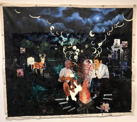
While these works were judiciously placed that’s not always the case. A triptych of small works by Jordan Seaberry are overwhelmed by the scale of the curved wall of a tower. He also has, large, grommeted canvases, one of which is “The Wandering Part 11,” in an adjacent space. The imagery ranges from self to family members. The large paintings entail detailed vignegttes against a dark background. They evoke comparisons to paintings by Kerry James Marshall in scale and content but less effectively.
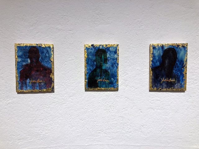
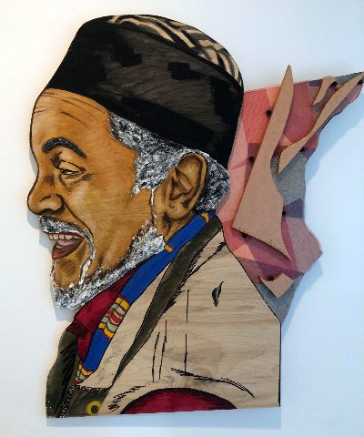
It’s a puzzle why one African American artist has been treated with generous space while the large portraits of another, Chanel Thervil, have not. In what’s almost an afterthought these engaging works have been crammed into a lower corridor space. We are denied the opportunity to step back to appreciate their sense of community and humanity. The large scale portraits are lovingly depicted with comfortable naturalism. It makes sense to put more intimately scaled work in a narrow viewing area. Surely, it confounds artists to be included in prestigious shows only to be displayed inadequately.
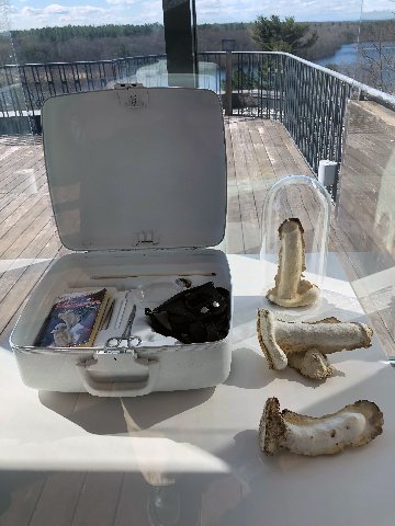
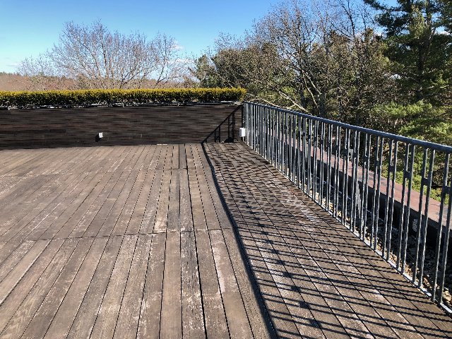
Also, why on earth did the curators opt to squander the museum’s wonderful roof deck with its panoramic views? It was a gorgeous day and we might have enjoyed the spring air. Instead, we were assaulted by the activist screed of Eli Brown. There were speakers placed around the bottom edge of the deck. A leader recited the lines of a history/ manifesto echoed by a choir of acolytes. The aggressive, fundamentalist delivery negated the value of its message. The approach evoked the methodology of preaching, propaganda and brain washing. We examined a vitrine of his fetish items, shaped like fungal penises. There was an impulse to escape rather than embrace and learn from the experience.
Compared to which other message works succeed with succinct wit and raucous humor.
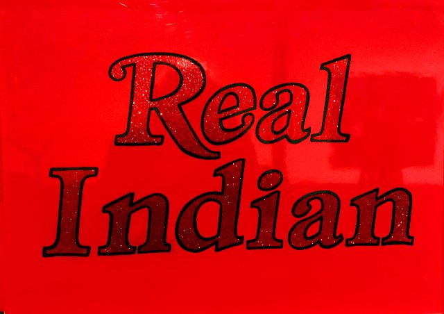
When traveling in the arid Southwest we encountered signs leading to trading posts. To induce us to stop at intervals they stated “Real Indians” or “Real Friendly Indians.” That’s what came to mind viewing the succinct word paintings of George L. Longfish. His colorful, strongly graphic signage “More Indian” and “Real Indian” evoked an inner glow. Then I cracked up viewing “Beaded Path Home.” Onto a large, framed, commercial map of the U.S. he has affixed, coast-to-coast, a string of beads. They are a readily identified signifier of Native American culture. He has subverted that notion in a devastating manner. With outrageous humor it holds a mirror to our received notions of Native American culture. Longfish succeeds by conveying his critique within the accessible structure of pop culture. I crave to see more of his work.
The lower floor has two small galleries generally used to show prints and photography. Both spaces were quite wonderful.
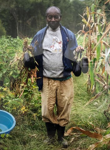
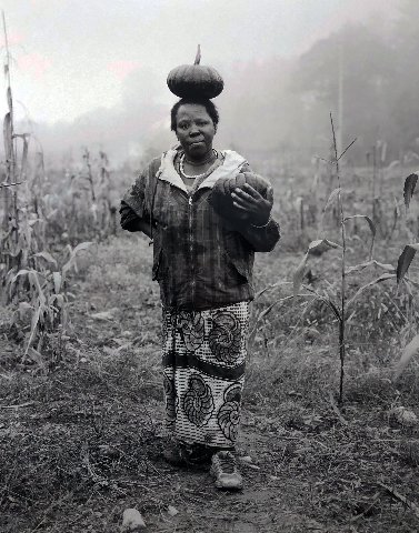
Yoav Horesh displays a room of documentary photographs. He has pursued this globally recording the devastation of war and forced migration. For the DeCordova project he focused on a small group of Islamic refugees on Fresh Start Farms in New Hampshire. It is a part of Organization for Refugee and Immigrant Success. The images are head on and conventional in all but their subject matter. They allow us to view the individuals and their disruptions. We consider what it is like to be a small community of Muslims in rural New England.
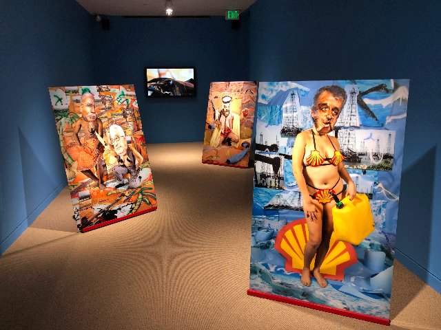
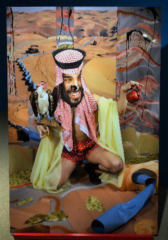
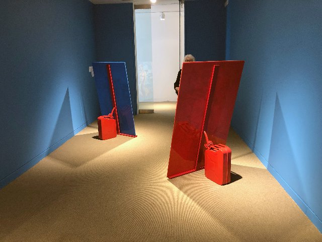
While doubling over with laughter the room of free standing photo collaged figures by Sheida Soleimani is deadly serious. It’s a shattering takedown of the greed of oil ministers and sheiks from Venezuela to Saudi Arabia. An executive of Shell Oil is spoofed as an ersatz Venus in a painting by Botticelli. The transgendered cubist figure has a male head on a female figure. She wears a bikini fashioned by strategically placed scallop shells. Walking behind the figures we find they are partly propped by oil cans. The artist evokes brilliant satire in the tradition of Jonathan Swift and William Hogarth.
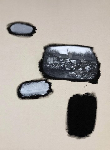
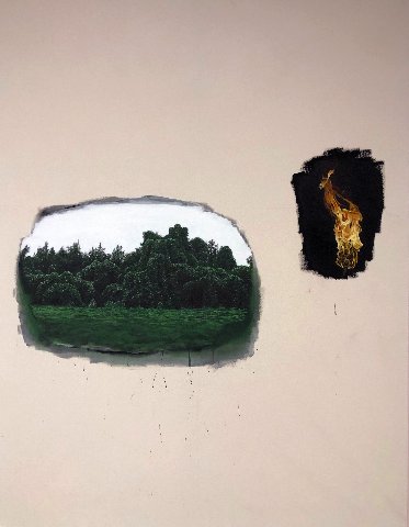
The trompe l’oeil works of William Binnie are puzzling. The rendering is contained within roughly defined ovals floating against a white ground on medium scaled paintings. In “The Vine That Ate the South” attention is drawn to meticulous photo-realist all consuming, invasive kudzu. The strategy of the artist confuses me. What is the point of creating vignettes? Does that make a greater impact than a conventional realist painting of threatening vegetation? Is the content enhanced by an experimental approach conflating conceptual art and realism?
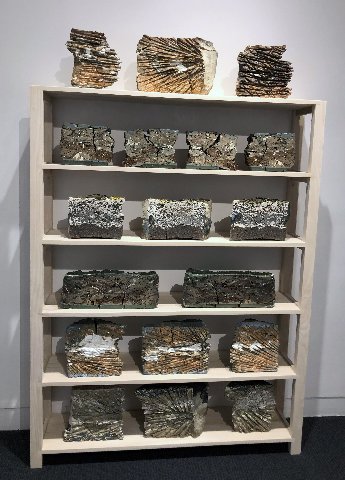
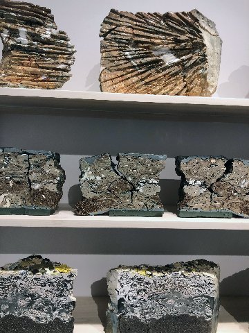
It takes a bit of research to connect with the work of Jonathan Mess. In the course of working with ceramics he was struck by the amount of waste that entails. He has developed a process of recycling that creates new work.Trashed clay material is placed into cardboard boxes and fired at high temperature. That causes shards, clay and glazes to meld. Later, using various saws and tools, slabs are sliced to reveal cross sections. These are displayed on generic shelves. It is intriguing to view layering that evokes many analogies to occurrences in nature.
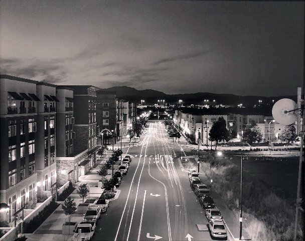
In a corridor there are several, black and white, large scale, night photographs by Stephen Tourlentes. They display not readily identifiable structures seen at a distance. There is elaborate lighting emanating from them. Labels reveal that they are images of prisons. They are a part of the series Prison and the American Landscape. As photographs they have a formalist sense of the beautiful. The subject, however, is anything but benign. He provides an interesting niche through which to consider daunting issues of incarceration. Viewed from a safe distance we may only speculate on chaos within the walls. It asks how far away we can remove ourselves from a vast social conundrum.
The Biennial remains on view through September 15.