
Rockwelling the Boat
Norman's Ersatz Conquest of Abstraction
By: Charles Giuliano - Aug 03, 2016
In 1916 Norman Rockwell (1894 – 1978) published his first illustration for The Saturday Evening Post. His work drew on the life styles of his friends and neighbors: Stockbridge, MA, then and now, became the epicenter for an idyllic (and formulaic) view of rural America. The Norman Rockwell Museum, with its focus on Rockwell’s iconic works, as well exhibitions celebrating other renowned illustrators and realists, is among the most visited museums in the region.
It is Mecca for those in search of a life affirming, aesthetically conservative view of the American dream. Rockwell created a jingoistic paradigm that could only have existed on the cover of a populist magazine. The museum also promotes the artist’s lifelong aspiration to be taken seriously by art critics. There are illustrators who achieved that status, including Winslow Homer, Edward Hopper, John Sloan, Rockwell Kent, N. C. Wyeth, Howard Pyle and Maxfield Parrish.
Rockwell’s commercial illustrations, based on keen observation and impeccable craft, became anathema to formalist critics of the post-war era, which was about, as Irving Sandler put it, “The Triumph of American Art.” Of course, the key word — “triumph” — implies winners and losers. The winners were the abstract artists and the losers, as defined by critics Clement Greenberg, Harold Rosenberg, and others, were the narrative artists of social realism and the America scene that preceded them. Art became a part of Cold War propaganda, a sign of political power that Serge Guilbault documents in his book How New York Stole the Idea of Modern Art.
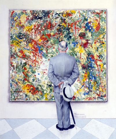
During the 1960s there was a palpable sense of conflict in the art world and beyond. Rockwell was targeted as the ultimate reactionary, the foe of the avant-garde. The theme of this exhibition is built around a single Rockwell work, “The Connoisseur.” The 1961 picture demonstrates that the artist took this challenge to heart. His painting is a witty and spot-on retort.
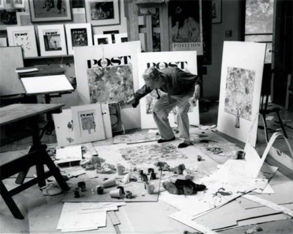
He undertook a careful study of abstraction, the tricks of its trade, and how they might be replicated. With his son Peter, Rockwell created a number of ersatz abstract expressionist studies. A couple of these experiments are displayed in the show, along with documentary photographs chronicling their making. Using a pseudonym, Rockwell entered his ‘abstract’ paintings in regional competitions. One of them won a prize at the Berkshire Museum.
Rockwell claimed that, if he was younger, he might have been an abstract artist. Hard to wrap your head around that: it’s like imagining an elderly Monet embracing cubism, which his life and career overlapped.
On a formal level, “The Connoisseur” is a fascinating picture. Other than its unique and sophisticated visual punch line, the work is consistent with his formula for Saturday Evening Post covers. A single central figure dominates the evenly spaced composition. There is Rockwell’s signature graphic simplicity and punch.
We see the viewer from the rear, which invites us to speculate on what he is thinking. The figure has the erect, squared-off posture of a middle-aged gentleman of prominent social status. He is impeccably dressed in a gray suit. His hands are clasped behind his back, and he is clutching a homburg hat and furled umbrella with bamboo handle. One gray glove has been removed. The amazing thing is that the painting the man is contemplating is a reasonable simulacrum of a canvas that could have been painted by Jackson Pollock.
Pollock and his technique dominated the popular and intellectual dialogue about post-war American art. A Life Magazine profile dubbed him “Jack the Dripper.” The general perception was that — because he dripped paint onto a canvas, instead of working with a brush — abstract art was easy. Anyone between the ages of 6 and 60 could make a Pollock-like painting. Indeed, many tried. Including, it seems, Rockwell.
What is so intriguing about “The Connoisseur” is wondering how Rockwell did it. And that may be an unanswerable question.
Rockwell’s painting appears to have been dripped, but is that the case? Did he drip and then scrape down and finish the rest of the canvas? Or did he individually create all of the drips? Either approach is mind boggling.
There is a short film by Hans Namuth which places the camera underneath a sheet of glass. Pollock painted over it. (There is a similar documentary featuring Picasso working in the studio.) During a dinner party after the shoot, Pollock became enraged, grabbed a bottle from under the sink, and went on a binge that lasted the rest of his tragic life.
Without that grim result, there is a craving for a documentary film that gives us Rockwell at work on “The Connoisseur.” To a trained eye, his “Pollock” is anything but. It is too chaotic, lacking the balletic rhythms of Pollock’s best works, such as “Lavender Mist” “Autumn Rhythm,” or “Number One.” Of course, ironies abound. At Pollock’s funeral, painter Willem de Kooning said “Pollock broke the ice.” Visiting a Rockwell exhibition that included “The Connoisseur,” de Kooning commented “square inch by square inch it’s better than Jackson!”
With this unique painting as its focal point, Stephanie Haboush Plunkett, the deputy director and chief curator of the Rockwell Museum, has attempted to provide a lively context for the cultural conflicts of the 1960s, when the artist created this work. Unfortunately, while many of the correct names are represented here (though there are a number of glaring omissions), Rockwell and Realism in an Abstract World is not a very satisfying exhibition — it is more like a sassy setup, a tantalizing straw dog. Without adequate wall labels or a catalogue essay — beyond the promo copy in the museum’s magazine — there is little here for scholars and critics to evaluate or that will provoke meaningful public debate.
And that is a shame, because the issues raised by “The Connoisseur” deserve a serious, measured, and scholarly approach. Instead, revisionist and keeper of flame Haboush Plunkett has served up a tag sale/ gimmick of a show that suggests she doesn’t have the vision or perspective for this ambitious a project.
Imagine this subject undertaken by a major museum with substantial resources. What would happen if you placed Rockwell’s intriguing but ultimately kitschy and cute painting next to major works by Pollock, Abstract Expressionists, Pop artists, Minimalists, and Photo Realists? Even along those aesthetic lines the exhibition misjudges the weight and balance of its participants. Absurdly, Robert Cottingham is elevated to a status on a par with Warhol and Pollock.
Where are the better narrative painters, including Jack Levine, Jack Beal, Alfred Leslie, or Odd Nerdrum? Why hang a dreadful work by Phillip Pearlstein while sticking a better painting by Jamie Wyeth in a corner? Is Bo Bartlett really a big deal? If so, according to whom? This is a show that gets the right questions wrong.
This article is reposted from Boston's Arts Fuse.