
At Clark Art Institute
Hue & Cry: French Printmaking and the Debate over Colors
By: Clark - Nov 13, 2021
In its latest exhibition, the Clark Art Institute presents an opportunity to explore the surprising but steady opposition to the use of color in printmaking in nineteenth-century France. Hue & Cry: French Printmaking and the Debate over Colors presents a wide array of French color prints from the Clark’s works-on-paper collection, by artists including Pierre Bonnard, Mary Cassatt, Paul Cézanne, Jules Chéret, Maurice Denis, Camille Pissarro, Henri de Toulouse-Lautrec, and Édouard Vuillard. The exhibition is on view December 11, 2021 through March 6, 2022.
“Color prints are so widely accepted and beloved today that it’s hard to understand the early opposition that these works received,” said Olivier Meslay, Hardymon Director of the Clark. “While the controversy over color might seem quaint, this exhibition tells a fascinating story to explain the ways in which the art world confronted this change. Beyond the intriguing look at how public taste and critical opinion collided, we think that our visitors will find great delight in exploring these beautiful prints.”
Brightly colored prints and posters are synonymous with Paris in the 1890s—a period known as the Belle Époque (beautiful age). Yet their extraordinary popular appeal both then and now masks the fact that, for a very long time, color in print was an outlier phenomenon. Not only was printed color difficult and expensive to achieve, it was also frowned upon as a matter of taste. Critics at the time scorned color printmaking, calling it gaudy, garish, vulgar, cheap, showy, and commercial. These negative associations discouraged the practice even after technical advances had made it more feasible and affordable. By the terms of the period, prints were understood as an art of black and white; if a print had color, it failed to qualify as fine art and had to be considered within some other classification, like illustration or advertising.
A century before the “color revolution” of the 1890s, color prints had already attained a zenith of technical perfection in France, but their popularity did not last. Extremely costly, and intimately associated with the decadence of the monarchy, these exquisite, printed confections saw both their relevance and their primary clientele disappear abruptly in the wake of the French Revolution. When color crept back into French printmaking toward the end of the nineteenth century, its reentry was eased by the example of Japanese ukiyo-e prints, then enjoying an immense vogue, and by progressive voices in the art world insisting that any means of expression chosen by an artist should be taken as legitimate. This launched a period of intense experimentation and production that spurred printmakers, seduced by the lure of color, to technically and aesthetically audacious feats. Still, color remained a problematic category: contested, controversial, and even forbidden at the Paris Salon until 1899. Ironically, the whiff of transgression may have fueled innovation: the great flowering of color printmaking waned once its fine-art status gained official acceptance.
“As soon as I arrived at the Clark, I knew that I wanted to organize an exhibition of the museum’s tremendous holdings in French color prints. These precious works, being extremely light-sensitive, can be displayed only rarely, so Hue & Cry offers a superb opportunity to look at a large number of them together. Comparing the color prints made in the late 1700s against those made one hundred years later, we can appreciate not just the remarkable technical leaps forward at the level of color print processes, but also the amazing degree of visual inventiveness and experimentation to which artists armed with the new techniques could aspire. Many beloved artists of the nineteenth century did their most creative work in the print medium, and the element of color endows these works with a visual appeal that still speaks powerfully to us today,” said exhibition curator Anne Leonard, Manton Curator of Prints, Drawings, and Photographs.
France’s First Color Heyday, 1760–1790
Since the Renaissance, chiaroscuro woodcut had been the most reliable technique of printing blocks of color, but it was inadequate to render more fine-tuned chromatic effects. By the late 1700s, attention turned to the possibilities of color intaglio (copperplate) printing, which offered greater subtlety. Multiplate intaglio printmaking—which meant inking multiple plates each with a single color and passing them successively through the press—built up color elements progressively on the paper to form a complete image. The method was costly, laborious, and time-consuming. Given these constraints, the market for these prints fell within financial reach of the upper classes only, and the subject matter printmakers offered reflected the licentious tastes of France’s nobility and aristocracy, who were soon to come to grief in the Revolution. The prints, thus, became fatally associated with the last days of decadence of the ruling class.
In line with the licentious tastes of their primary clientele, color prints of the 1780s often feature lightly erotic subject matter, spiced with humorous or naughty double entendres, which can be seen in works by artists such as Philibert Louis Debucourt (French, 1755–1832). In The Climb, or Morning Farewell (L’escalade ou les adieux du matin) (1787), two partly undressed lovers share a farewell kiss after a tryst, while forgotten articles of clothing lie draped over the brick wall. There is a suggestion of divided affections, as the dog—normally a symbol of fidelity—gives the woman a second “kiss” on her left hand. The sumptuous hues and wealth of detail mark it as one of Debucourt’s most accomplished color prints. Themes of love and flirtation typically blend with sarcastic hints of infidelity and hypocrisy, as in The Two Kisses (Les deux baisers) (1786). The incongruity between the opulently styled young woman and her elderly admirer is amplified by a large, unfinished painting of the two of them that Debucourt stages on an easel at left. As the older man gazes complacently at the kiss memorialized on the canvas, the object of his love receives a kiss on the hand from the painter—who is seen sneaking from behind, still clutching his palette and brushes.
A Century Later: Return to Color Intaglio
Tarred by its prior associations with frivolity and excess, color printmaking lay dormant in France’s fine-art realm for most of the nineteenth century. Following the opening of Japan to the West in the 1850s, however, Japanese color woodblock prints began to arrive in Paris and artists and collectors alike took notice.
Because the color woodblock process, reliant on a workshop-style division of labor in Japan, was impractical for most individual artists to attempt, they sought instead to replicate the effects using intaglio processes. Mary Cassatt’s (American (active in France), 1844–1926) famed set of ten color aquatints inspired by ukiyo-e prints was just one of the experiments being attempted by printmakers at the time. Although Cassatt was not the first to return to color intaglio printmaking, her single-minded focus on the pursuit of the craft was exceptional among the French artists of her era. In 1890, Cassatt visited the watershed exhibition of Japanese ukiyo-e prints at the École des Beaux-Arts in Paris and remarked afterward: “You couldn’t dream of anything more beautiful … I don’t think of anything else but color on copper.” In Mother’s Kiss (1891), Cassatt adapts conventions of ukiyo-e prints to an image of maternal tenderness.
Other examples include Eugène Delâtre (French, 1864–1938) and Camille Pissaro (French, 1830–1903). Delâtre continued his father Auguste’s commitment to relentless experimentation in intaglio printmaking. En Sentinelle (1905), a charming vertical image of a young boy standing at attention, appeared in the Zeitschrift für bildende Kunst, a German annual publication. Delâtre signed his name prominently at the bottom, with “Imp. par” emphasizing his role as both designer and printer. Peasant Women Weeding the Grass (c. 1894) includes precious notations in pencil about Pissarro’s color intentions. They may be notes to a technician about desired effects, though the artist purchased his own printing press around this time. The mention of specific pigments suggests a possible translation between painted and printed versions of this composition.
Color intaglio works were usually printed in small editions, making them rare today. Many notable artists of the period avoided color intaglio, however, perhaps because of the need to relinquish the printing process to a technician. The challenge to unitary authorship was yet another reason that objections to color printmaking persisted in this period.
Color Lithography Hits the Streets: Toulouse-Lautrec and Chéret
Color lithography posed the greatest affront to sensitivities around printed color, in part because lithography itself had never enjoyed secure fine-art status. Invented in 1798 as an efficient method of reproducing sheet music, commercial printed matter, newsprint illustrations, and other ephemera in near-industrial quantities, lithography stood in opposition to the aesthetically motivated intaglio techniques, characterized by small print runs.
Color lithography was, however, an ideal medium for advertising posters, which emerged as a new language of the modern city. Posters by Jules Chéret (French, 1836–1932), Henri de Toulouse-Lautrec (French, 1864–1901), and others—publicizing everything from the night spots of the Montmartre entertainment district to skating rinks and cough drops—rose from an “art of the street” to become the most distinctive feature of 1890s visual culture. Since posters degraded quickly with exposure to the elements, artists filled demand from collectors by printing the same designs at smaller scale, with the same lithographic technique but on finer paper. Likewise, color lithographs that had been designed from the start as portable collectibles began to incorporate the bold chromatic and visual strategies typical of posters.
With works including Paris Illustré (1888), Eldorado (1894), Palais de Glace Champs Elysées (1895), and Pastilles Poncelet (1896), Chéret earned the title “father of the modern poster.” In Vin Mariani (1894–95), Chéret sought to convey the euphoric effects of Vin Mariani, the first commercial cocaine-based beverage developed by Parisian chemist Angelo Mariani in 1863. Like other female figures in Chéret’s posters—known as “Chérettes”—the woman in Vin Mariani appears joyous, her posture and clothing unconstrained by bourgeois convention. Besides being a powerful ingredient in advertising of the period, the message of insouciant fun and liberation came to define the Belle Époque sensibility.
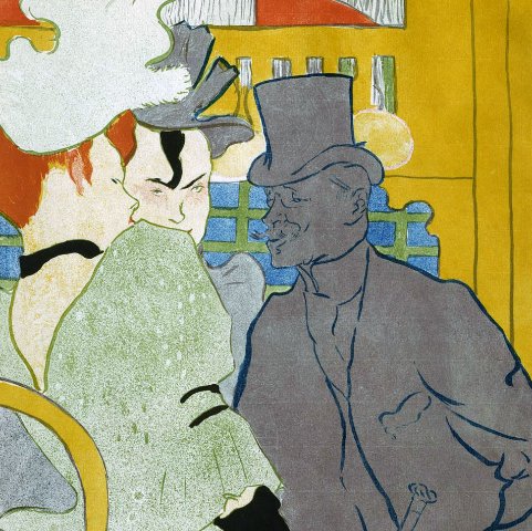
Toulouse-Lautrec recorded the dance halls and brothels of Montmartre, often using recognizable actresses, notables, and dancers in his pictures. At the Moulin Rouge: La Goulue and Her Sister (1892) adopts the flat color planes, cropped composition, and shallow spatial recession of Japanese ukiyo-e prints. In his scenes of theaters, cabarets, and dance halls, Toulouse-Lautrec often trained his attention more closely on the spectators than the performers. Balcony with a Gilded Grotesque Mask (1894) shows a woman seated in a balcony emphasizing the act of looking with the opera glasses she holds up to her eyes. Her vivid red lips, a focal point, are pursed as if in appraisal of what she is seeing on stage. This lithograph was made for the playbill of Marcel Luguet’s play Le Missionnaire at the Théâtre Libre. Toulouse-Lautrec’s infatuation with actress Marcelle Lender—he is said to have watched her at twenty separate performances of the same play—translated into dozens of sketches, a major painting, and several lithographs. The most lavish is Mademoiselle Marcelle Lender, Bust-Length (1895), which was printed in eight colors and published in the German arts magazine Pan. On grounds of its expense, complexity, and “frivolous” French style, Toulouse-Lautrec’s lithograph generated controversy among the editors of Pan, even contributing to the resignation of the one who commissioned it.
Color Lithography: But Is It Art?
One great advantage of lithography, by contrast with intaglio or woodblock methods, was that artists could draw freely on the stone matrix or transfer a design directly from another surface without the need for specialized tools. The operations required to produce a design for print thus corresponded more closely to those for drawing or painting, while lithography’s adaptable character enabled an almost unlimited range of aesthetic effects. Energized by this freedom of gesture and taking note of the growing acceptance of fine-art color lithography, leading artists were increasingly willing to experiment with it. Motivations and engagement levels varied, however. Paul Cézanne (French, 1839–1906) used lithography only half-heartedly as a means of reproducing designs in other media, while for Pierre Bonnard (French, 1867–1947) and Paul Signac (French, 1863–1935), it held the key to unprecedented pictorial innovations. Henri Rivière (French, 1864–1951) turned to lithography after a lengthy immersion in Japanese color woodblock printing—an endeavor that, for a lone practitioner, proved too labor-intensive to be sustainable. In an about-face, Émile Bernard made hand-colored lithographs mimicking much earlier print traditions.
One of Bonnard’s most beloved images, The Little Laundress (La petite blanchisseuse) (1896), offers a child’s-eye view of the world. The restrained color palette is applied in unmodulated blocks for maximal expressive effect—with a nearby dog rendered as simply a sum of splotches—and Bonnard uses a similar economy of means to suggest the cobblestones in the road.
Signac’s anarchist political bent suggests that his future vision of harmony for human society would require a destruction of the present order. In the Time of Harmony (Au temps d'harmonie) (c. 1896) is subtitled with a phrase that translates to “the golden age is not in the past, it is in the future.” This great symphony of color mixtures, deriving from the three primary colors, looks toward the future and could not contrast more starkly with Émile Bernard’s hand-colored lithograph of the same year, Saint Mary Mother of God with a Lily (Sainte Marie Mère de Dieu avec un lys), also relying on red, blue, and yellow, but in a throwback to the past.
In appearance, Rivière’s color lithographs Horse in Cornfield (1898–1917) and Aspects of Nature, no. 11: Sunset (1898) resemble the color woodblock prints he was making in the early 1890s. Determined to be authentic to the Japanese print process, Rivière took charge of all the steps himself—from drawing and transferring the design to the block, to inking and printing a separately carved woodblock for each color. Rivière’s shift to lithography around 1894 meant that he could leave all the complexities of the print process to a specially trained technician. By 1898, Rivière had developed a greater freedom with the lithographic medium, no longer constrained by the more chunky, boxy aesthetic of his color woodblock printing. Aspects of Nature, no. 11: Sunset shows the results of a more fluid mixing of colors on the lithographic stone, where hues did not have to be confined to discrete areas. Although less akin to Rivière’s original ukiyo-e inspiration, this print shows that the artist had fully assimilated other aspects of Japanese aesthetics, such as the steeply pitched perspective and the dramatic cropping of the composition at the margins.
Color Lithography at Home: Four Nabi Portfolios
Produced in the same medium as the posters of Toulouse-Lautrec, but possessing an opposite sensibility, the lithographs in the Nabi portfolios represent the pinnacle of color printmaking in the very last years of the nineteenth century. Four single-artist portfolios featured in the exhibition were commissioned by Ambroise Vollard, the art dealer and publishing impresario who had given Cézanne his first solo exhibition and boosted the careers of leading modern artists such as Pablo Picasso. Though his ventures were not always profitable, Vollard had an eye for the most avant-garde printmaking of his time and left an incalculable mark on the trajectory of twentieth-century art. In these intimate prints—intended for private, domestic enjoyment—Bonnard, Maurice Denis (French, 1870–1943), Ker-Xavier Roussel (French, 1867–1944), and Édouard Vuillard (French, 1868–1940) deploy the raw materials of lithography to produce intensely personal reflections on landscape, the modern city, and even conjugal love. As the portfolios were often split apart and sold as individual sheets, the Clark is fortunate to possess four intact sets, displayed in their entirety in this exhibition.
Bonnard’s twelve-print series Some Aspects of Parisian Life (Quelques aspects de la vie de Paris) (c. 1898) conveys his interest not in memorializing Paris’s major monuments but rather in capturing the flavor of daily life in the city, often depicted from unusual angles. Through the use of plunging perspectives, varying formats, and sometimes-fuzzy edges, Bonnard asserts an individual, idiosyncratic gaze. Although his palette is somewhat limited—tilted toward browns and ochers—he produces stunning effects with the occasional use of pure black forms that, almost floating free of what they represent, point a path toward abstraction.
Denis’s suite, titled Love (Amour) (1898), centers on the woman he married in 1893, Marthe Meurier. Using the greatest delicacy, he connects the private realm of their marriage with larger allegorical references to courtly love, Catholic devotion, and mysticism—all hallmarks of his art. The soft tones and languorous rhythms express a sweet, naïve aesthetic running somewhat at odds with the Nabis’ avant-garde commitments.
Roussel’s set of color lithographs, Landscapes (Paysages) (1898 and c. 1900) was originally intended to include twelve compositions plus a cover, but only seven were completed. Although Roussel made artist’s proofs of the remaining five landscapes, they were never editioned—perhaps an indication that Vollard by that time had despaired of achieving financial success with the single-artist portfolio project. Unlike his three Nabi peers, Roussel gravitated toward mythological landscapes peopled, if at all, by silhouetted female figures. Like the others, however, he worked with master printer Auguste Clot (French, 1858–1936) to achieve the subtlest possible effects of color, pattern, and texture.
Vuillard produced some of his most adventurous work in the medium of color lithography. In Landscapes and Interiors (Paysages et intérieurs) (1899), he blends his signature focus on close interior spaces and decoration with a couple of airy vistas. Vuillard subjects indoor and outdoor scenes alike to extreme flattening and spatial compression, an illusion achieved by laying pure colors one atop the other within a cropped visual field. Vuillard and Clot, both virtuoso colorists, required up to six lithographic stones—each inked and passed through the press separately—to build up the desired chromatic effects.
Hue & Cry: French Printmaking and the Debate over Colors is made possible by Denise Littlefield Sobel.
The exhibition is organized by the Clark Art Institute and curated by Anne Leonard, Manton Curator of Prints, Drawings, and Photographs.